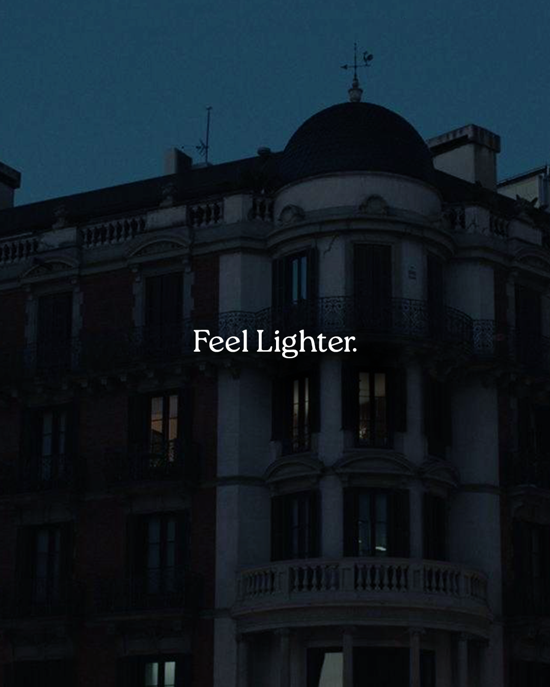
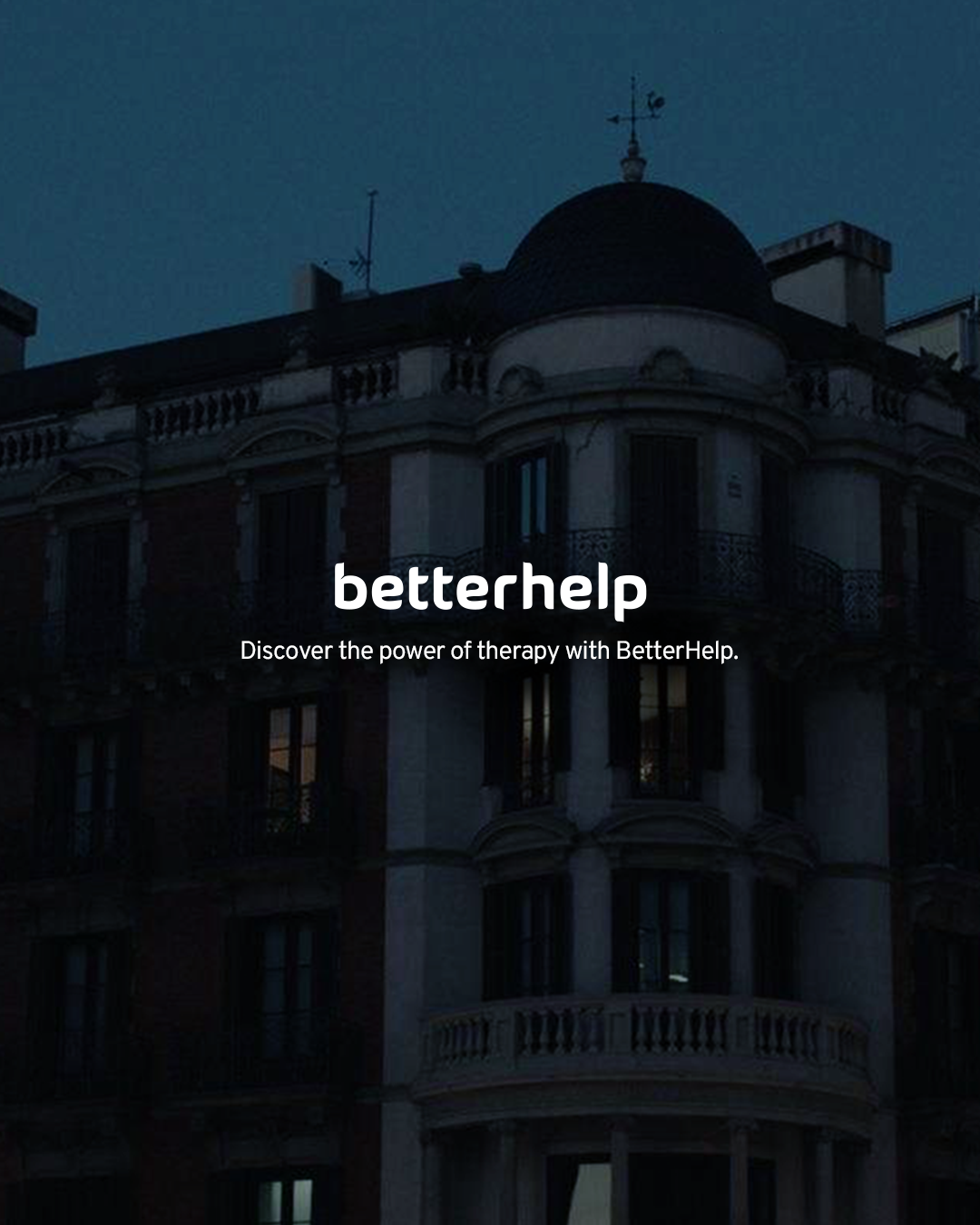
Feel Lighter Campaign
360° International Brand Launch for BetterHelp 2026
Role: Lead Designer
Impact: Built and scaled a cross-channel visual system and managed performance rollout that generated thousands of member sign-ups across 9 markets.
The Challenge
Feel Lighter was BetterHelp’s New Year 2026 campaign, designed to launch the year with cultural relevance and clinical credibility. New Year campaigns often lean into loud motivation and surface-level optimism. For a mental health platform, that approach feels hollow. We needed to:
Tap into the emotional weight people carry into a new year.
Maintain clinical credibility.
Launch internationally with cultural sensitivity.
Scale across hundreds of performance-driven assets without losing craft.
The Insight
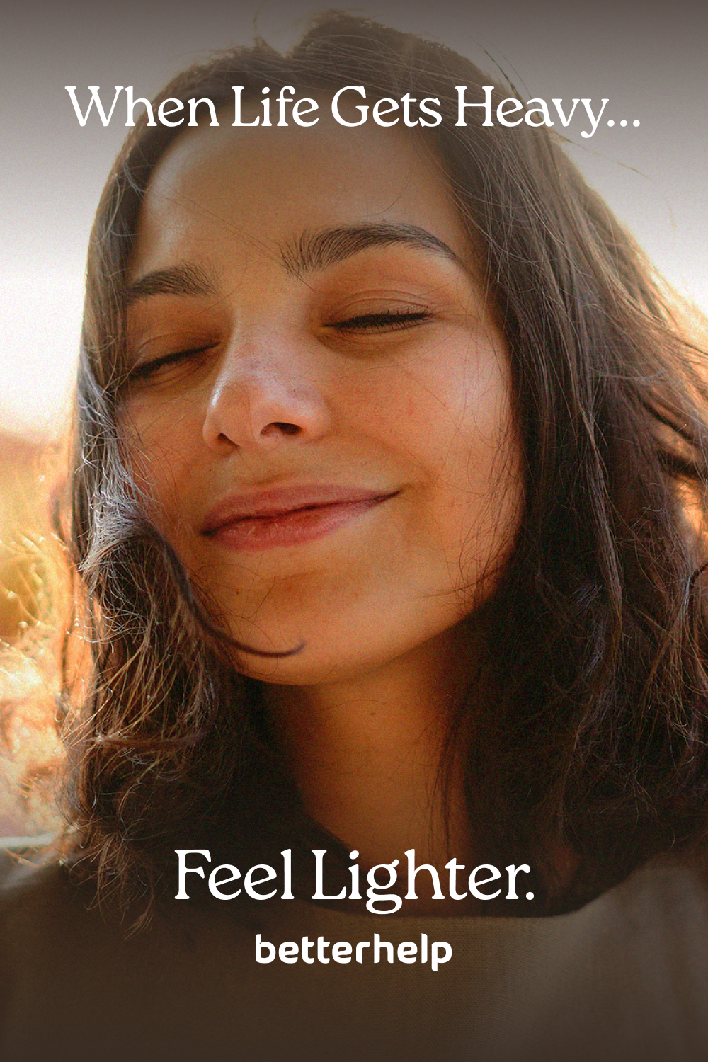
Emotionally, people are tired. The New Year can feel noisy with the pressure to build the perfect resolutions. We quickly realize the New Year isn’t actually about ambition—it’s about relief. The idea became simple and human:
Whatever heaviness you’re carrying, therapy helps you feel lighter.

-
TV, Paid Social (Meta, TikTok, YouTube, Pinterest, Reddit)
-
United States, Canada, Ireland, UK, France, Germany, Austria, Spain, Netherlands
-
Associate CD: Ryan Fetters
Copy: Christian Villodas
Design: Andrea Celis
My Role
As Lead Designer, I translated that core emotional concept into a scalable campaign system. I:
Developed the campaign’s key art and visual language
Built a modular design system that could scale across 9 markets
Established color architecture (dark to light transitions)
Created the end card framework used across all video performance ads
Directed imagery selection and color grading principles.
Ensured emotional consistency across TV and paid social.
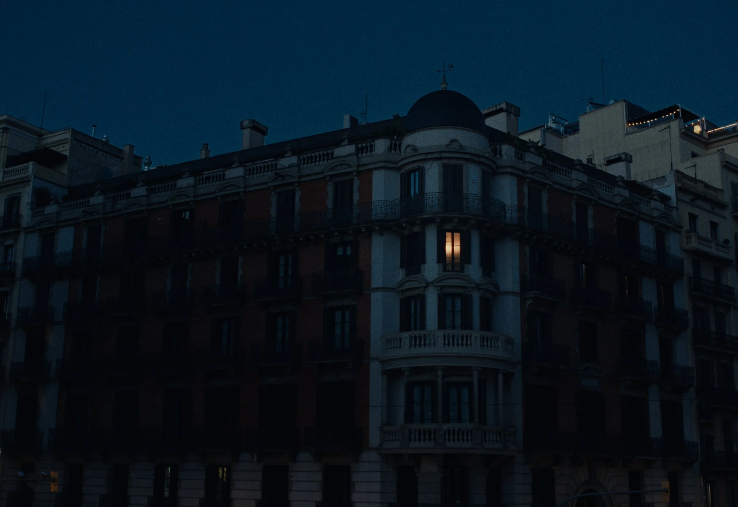
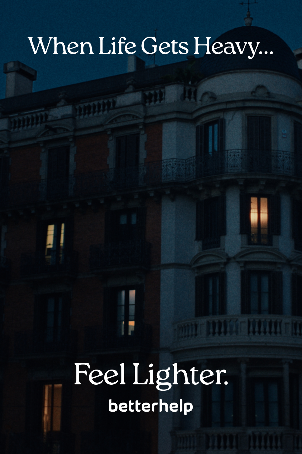
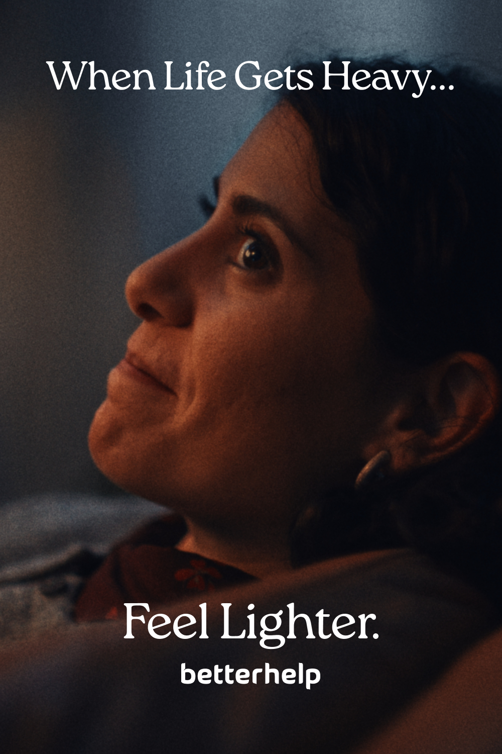
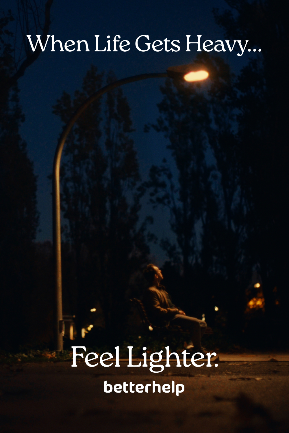
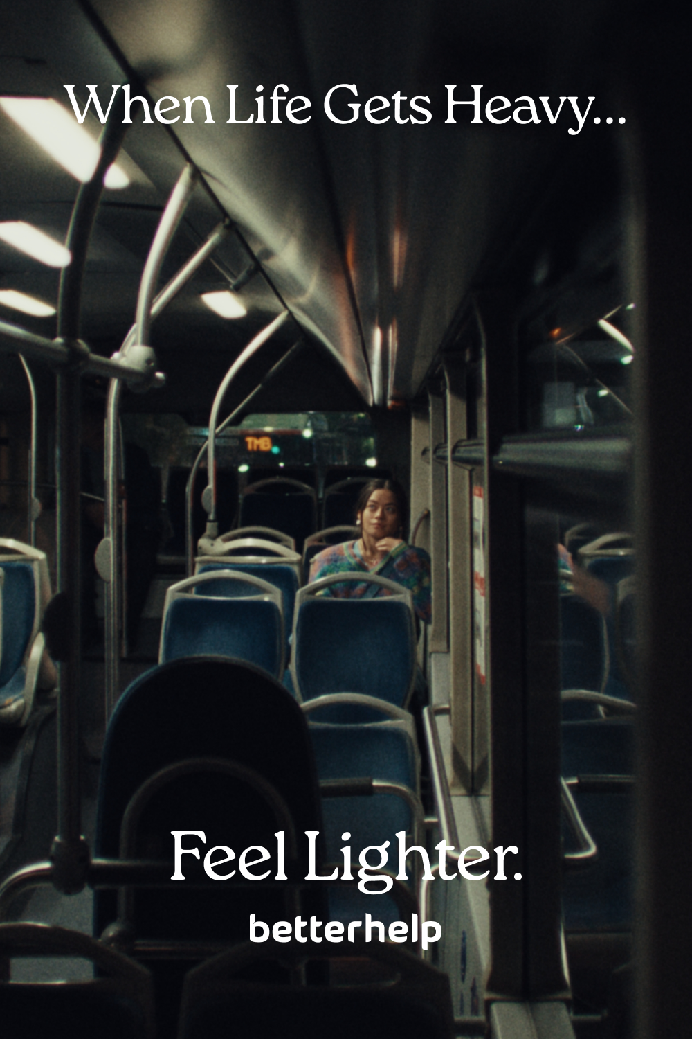
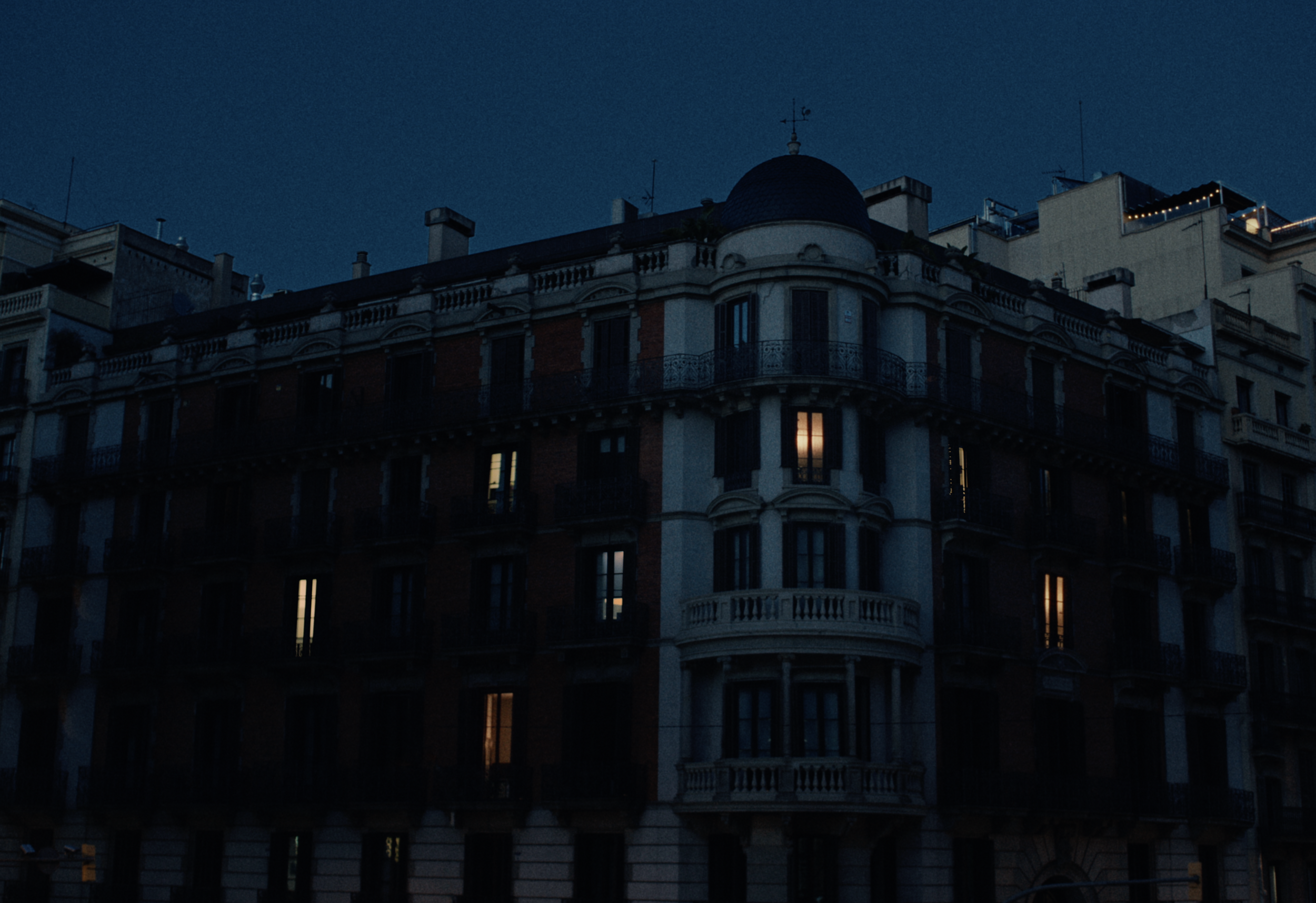
Television Commercials
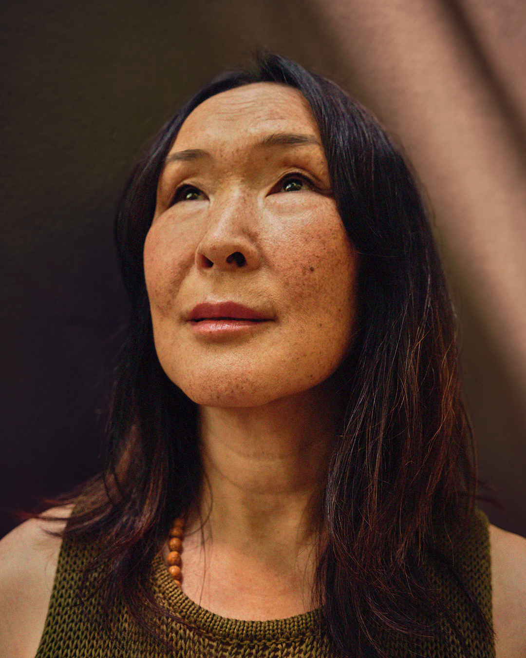
The TVCs established the emotional and visual foundation for the entire campaign. Its core device, transitioning from darkness into light, became the organizing principle for every other asset.
Design System
Everything in the campaign mirrors the emotional arc of the TV commercials, moving from cool, heavy tension to warmth and relief once BetterHelp enters the story.
The design system was built to include:
a color transition framework
tagline + logo lockup
photography selection


Motion Graphic Ads
Performance channels require clarity within seconds. Emotion has to land fast.
For motion:
Typography became a main storytelling device.
Movement mirrored emotional release—tension to softness.
Lifestyle, emotion-based video was key for translating what ‘Feel Lighter’ looked like in real life.
Localization
Layout flexed across localized assets but the key was keep the hierarchy and visual expression intact.
US, Canada, Ireland, & UK Carousel:
France Carousel:
Germany & Austria carousel:
Spain Carousel:
Static Ads