BetterHelp Brand Refresh
Evolving Toward Trust, Sophistication & Human-Centered Design
The BetterHelp Brand Refresh marked a pivotal shift in how we show up visually and emotionally. As our brand matured and consumer expectations evolved, we recognized the need to move beyond a youthful, illustration-forward identity toward a more trusted, human-centered design language.
As a core leader on the brand evolution team, I partnered closely with leadership to define and scale this new direction. I played a key role in evolving our typography, overall brand expression, organic social brand guidelines, while operationalizing the refresh across all company-wide systems. From building scalable templates to modernizing evergreen paid assets, I ensured the new brand wasn’t just conceptual, it was implemented consistently and effectively across every touchpoint.
-
Senior Designer: Megan Atwater
Creative Director: Kate Keparutis
Associate Creative Director: Ryan Fetters
Copywriter: Christian Villodas
Senior Designers: Andrea Celis, Micaela Munoz
Designer: Alyssa Long
Evolving the Core Brand Expression
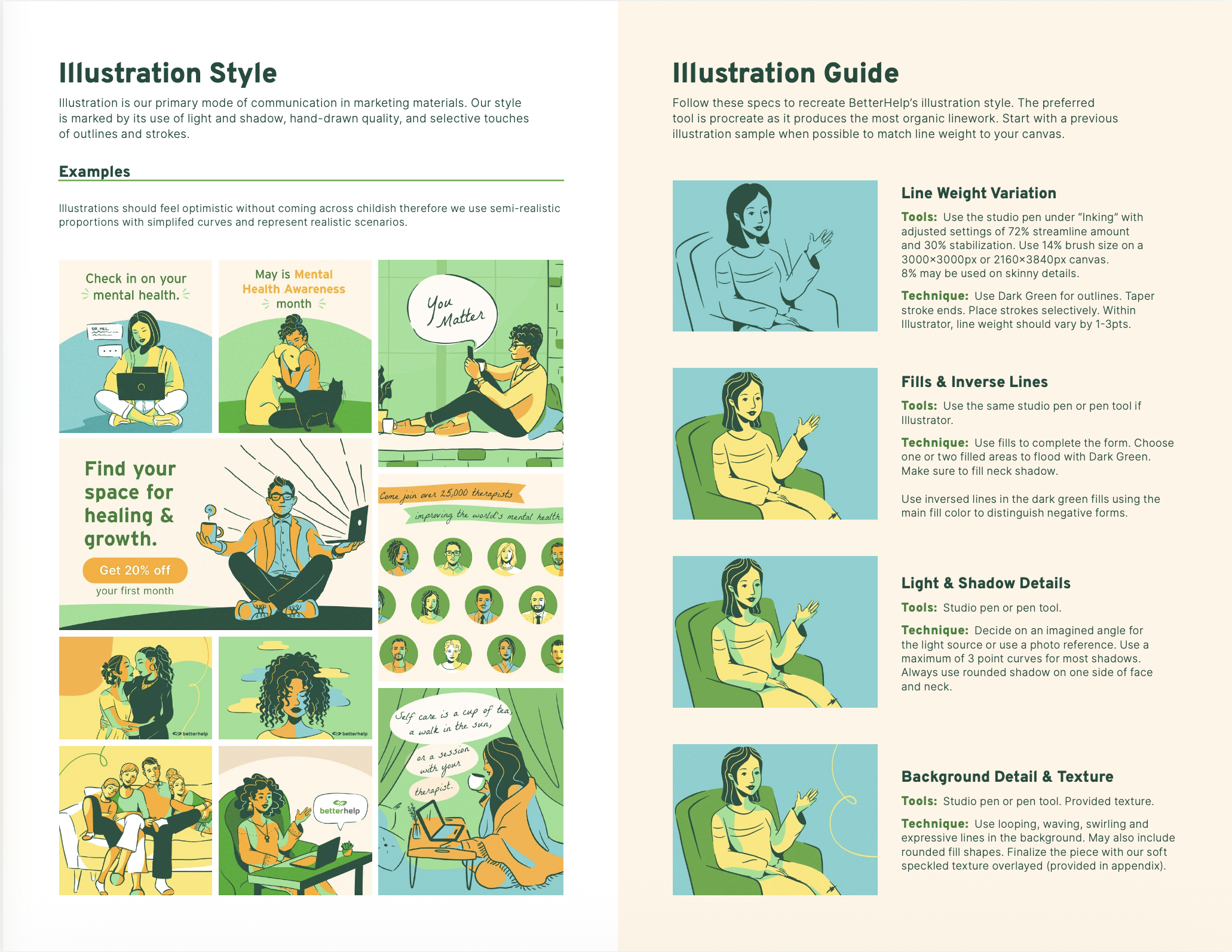
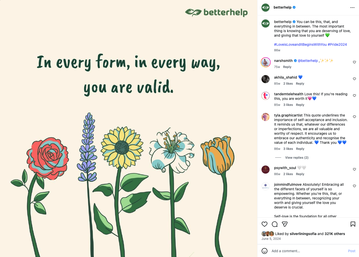
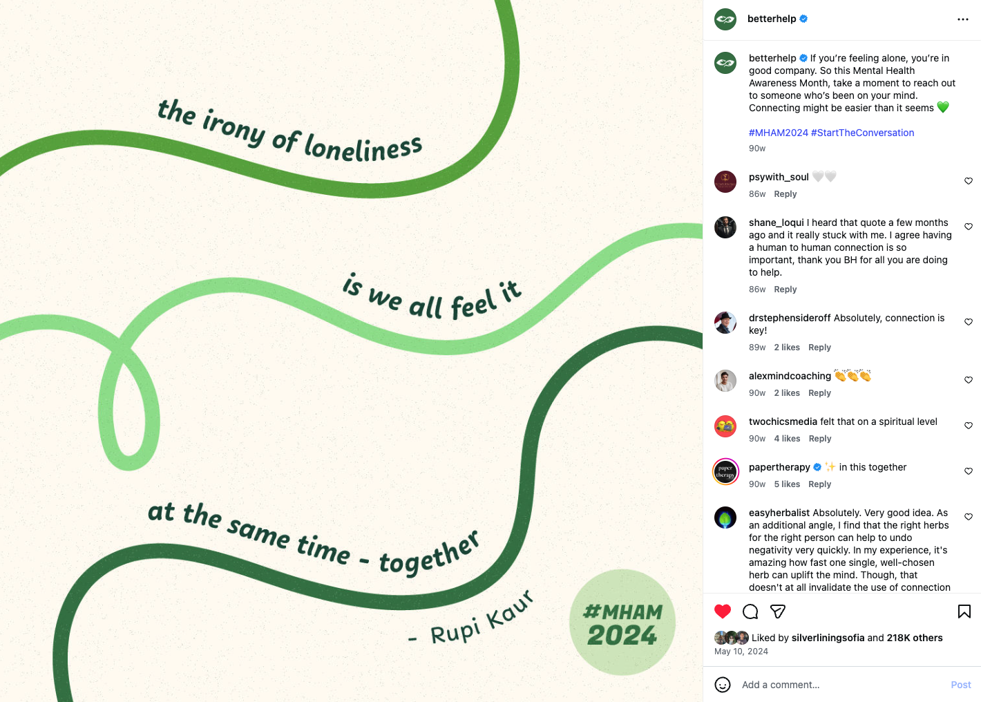
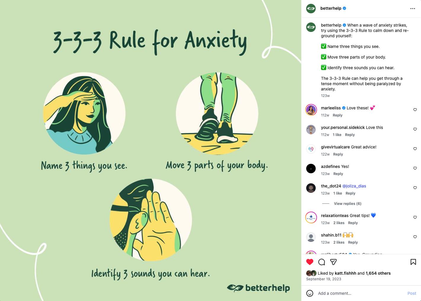
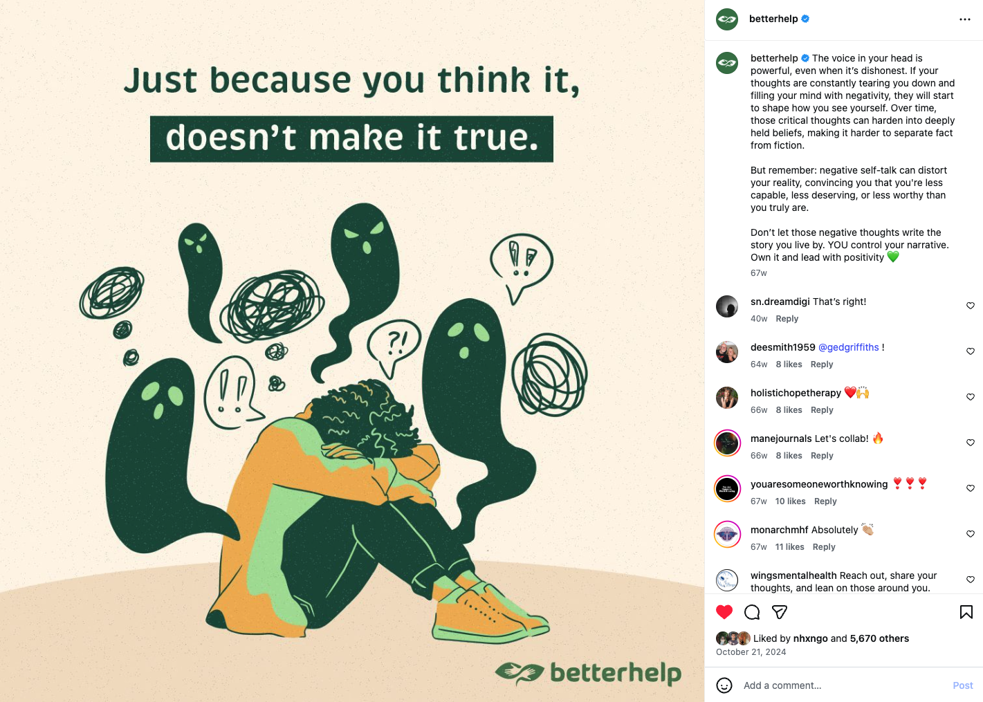
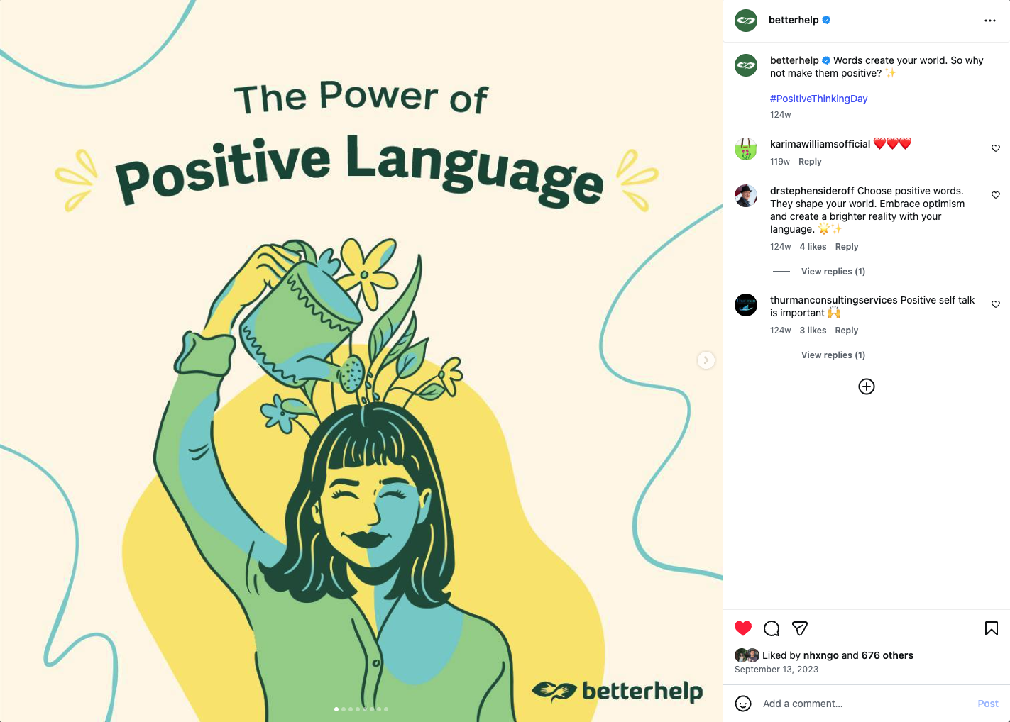
Before
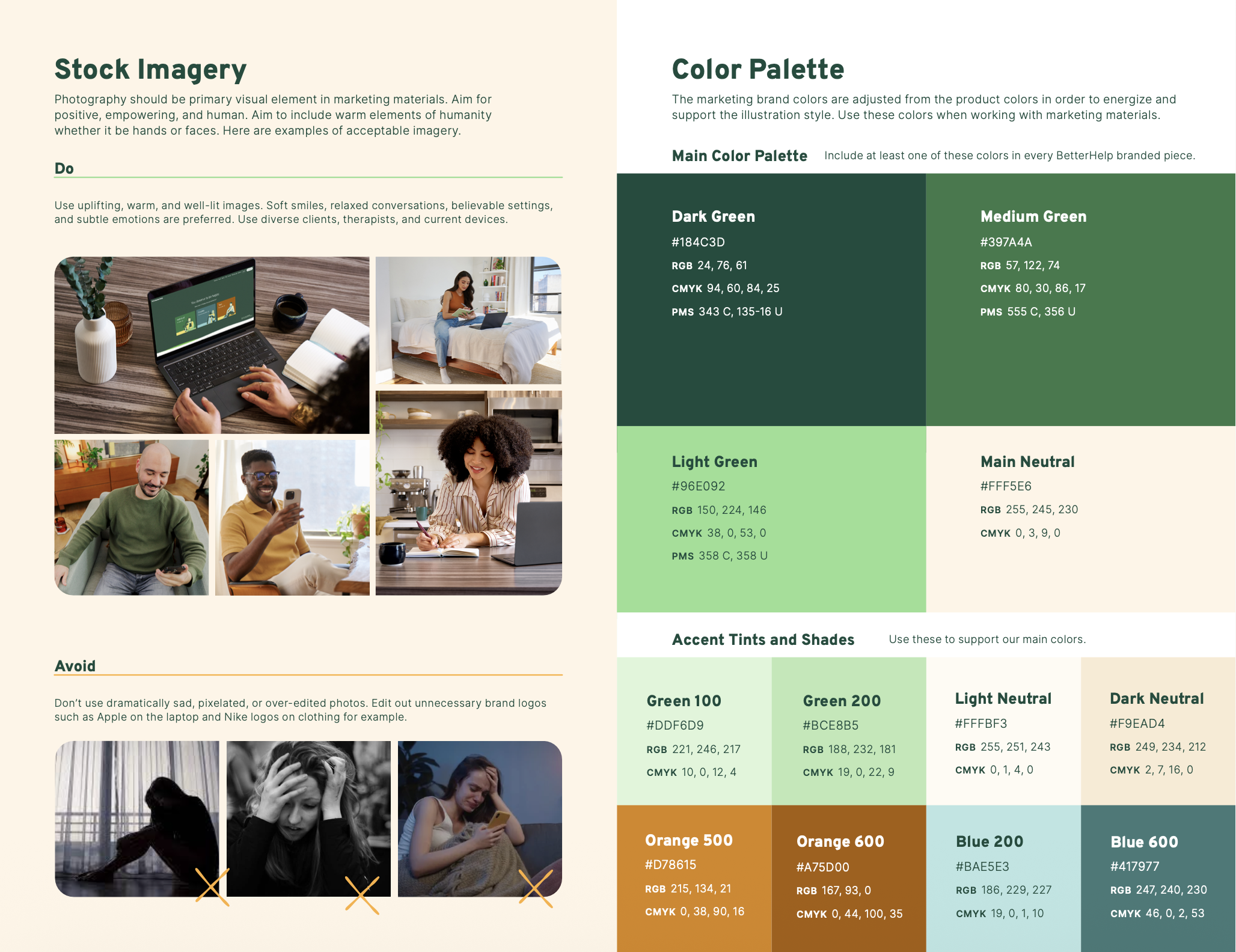
BetterHelp’s previous brand expression leaned heavily on bright, youthful color palettes, illustration-forward storytelling, and typography that lacked cohesion. While approachable, the system felt limited in its ability to convey the trust, credibility, and maturity expected of a clinically grounded mental health platform.

After
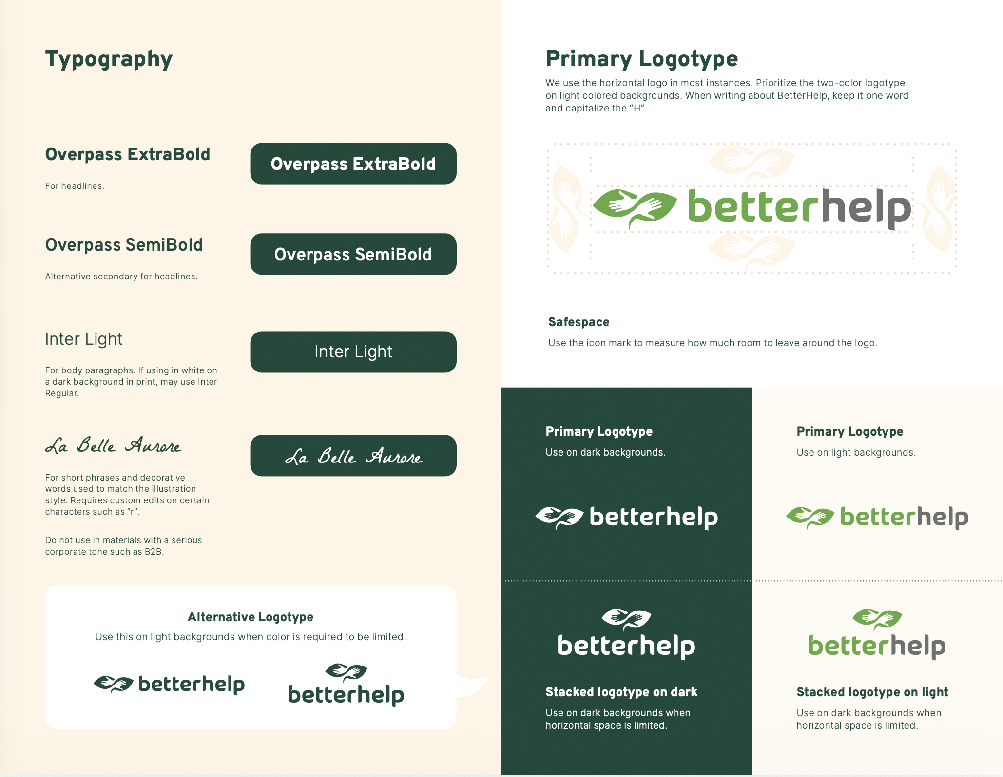
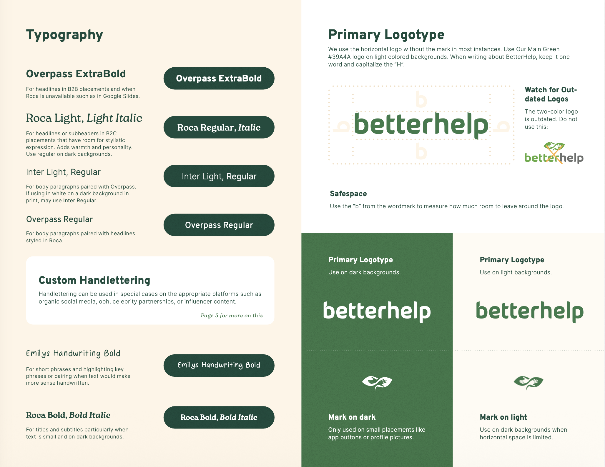
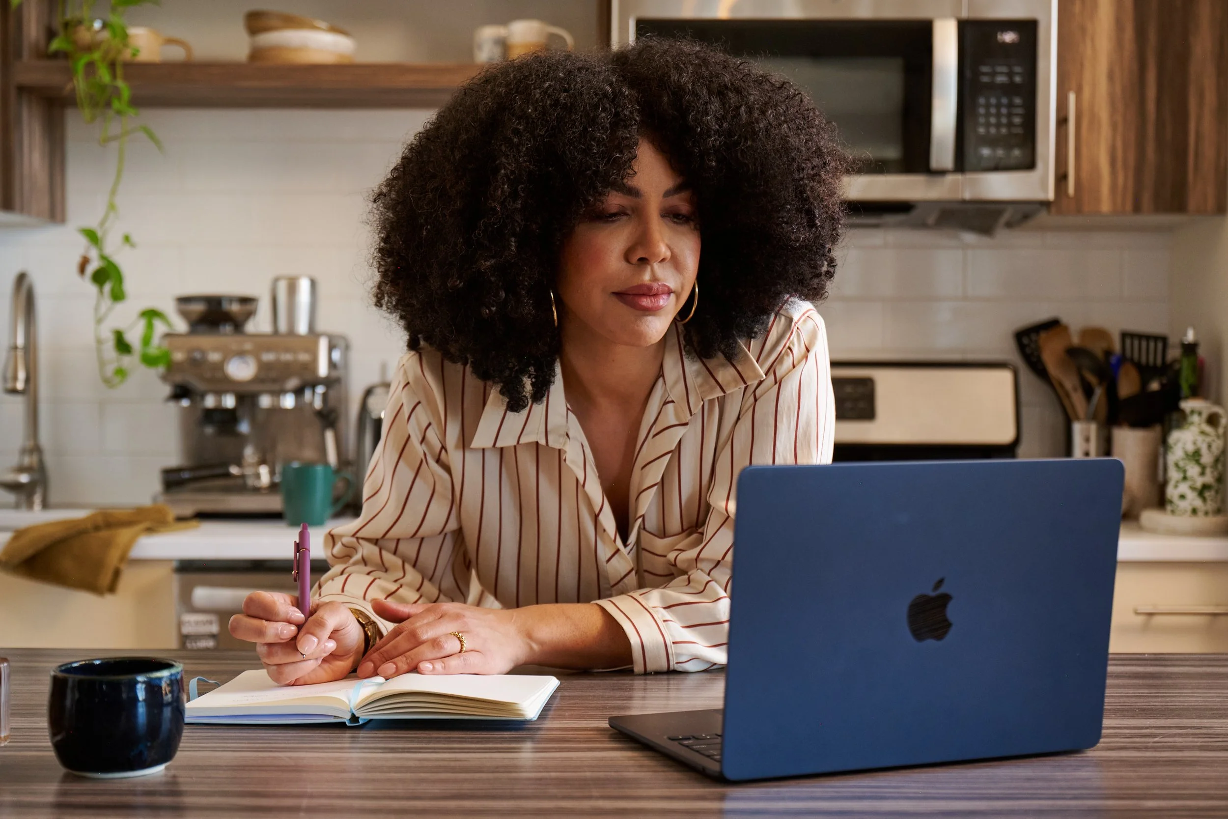
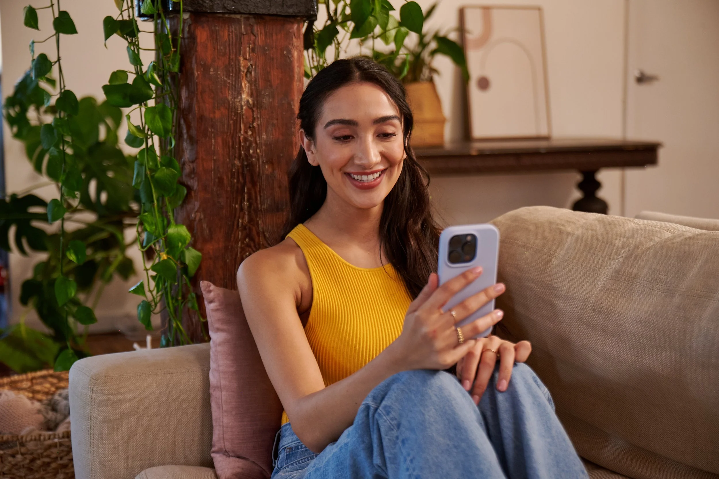
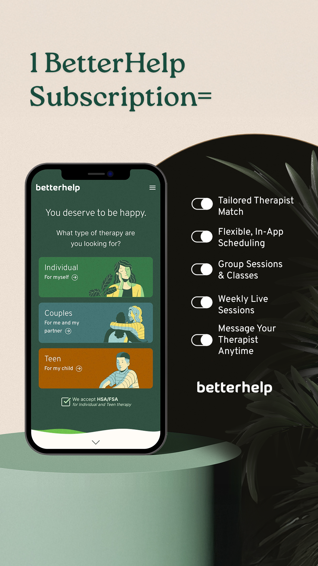
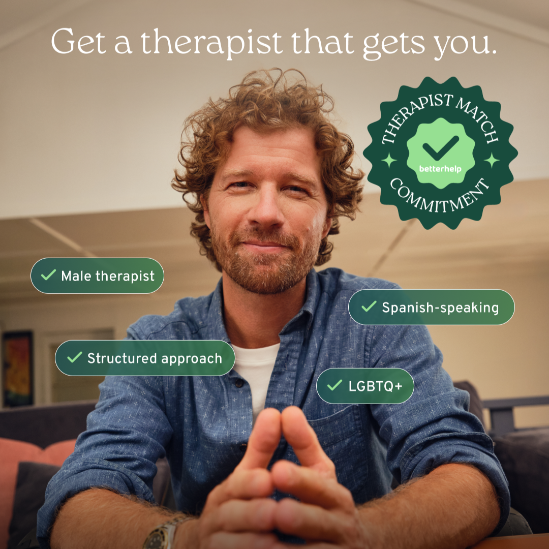
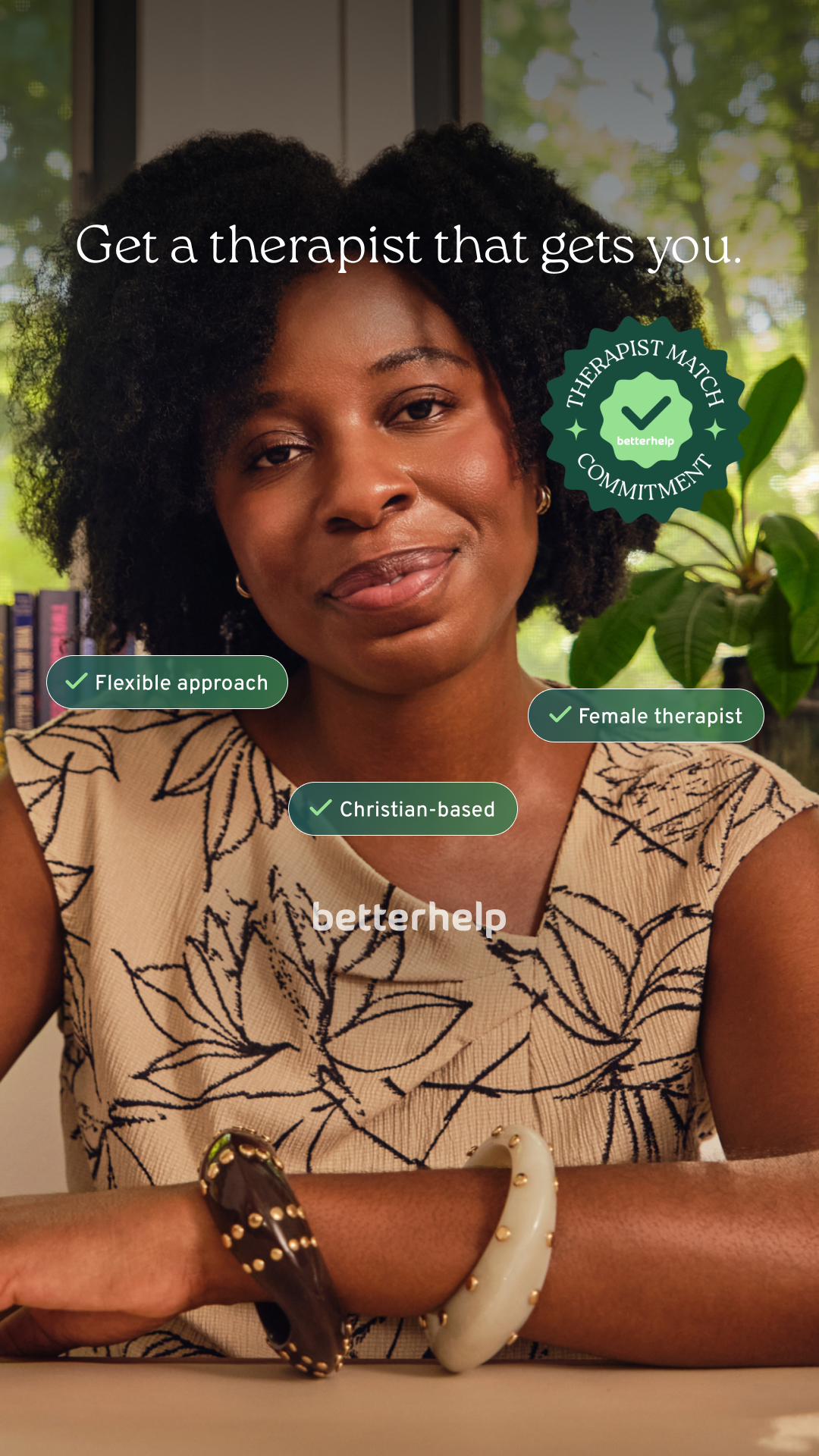
As a core leader on the brand evolution team, I played a significant role in evolving our visual identity toward a more elevated, human-centered design language. We shifted from illustration-led storytelling to lifestyle photography as a primary expression of the brand, grounding our presence in real, human moments to build emotional authenticity and trust. I led the introduction of Roca as our new typographic foundation and contributed to simplifying the logo by removing the outdated icon, creating a cleaner, more confident wordmark with greater flexibility.


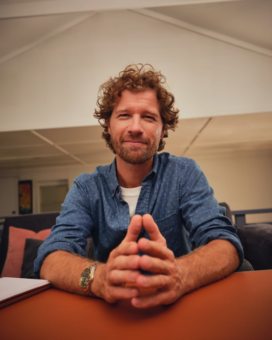
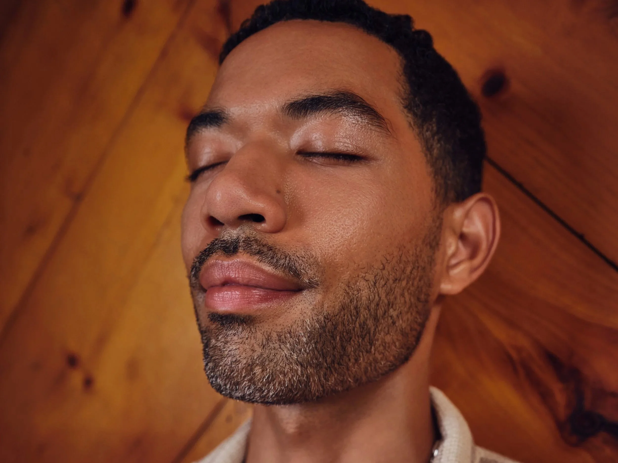
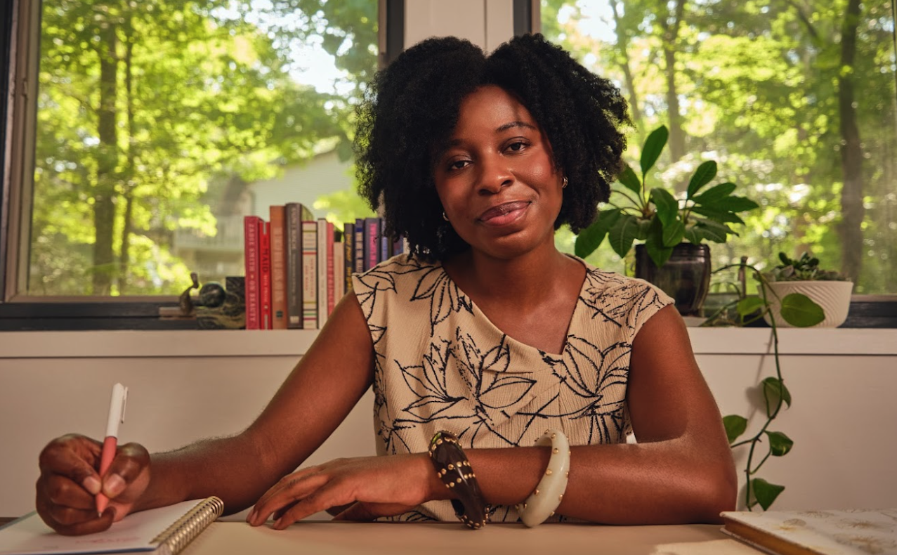
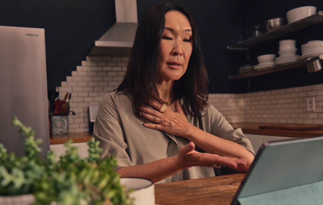
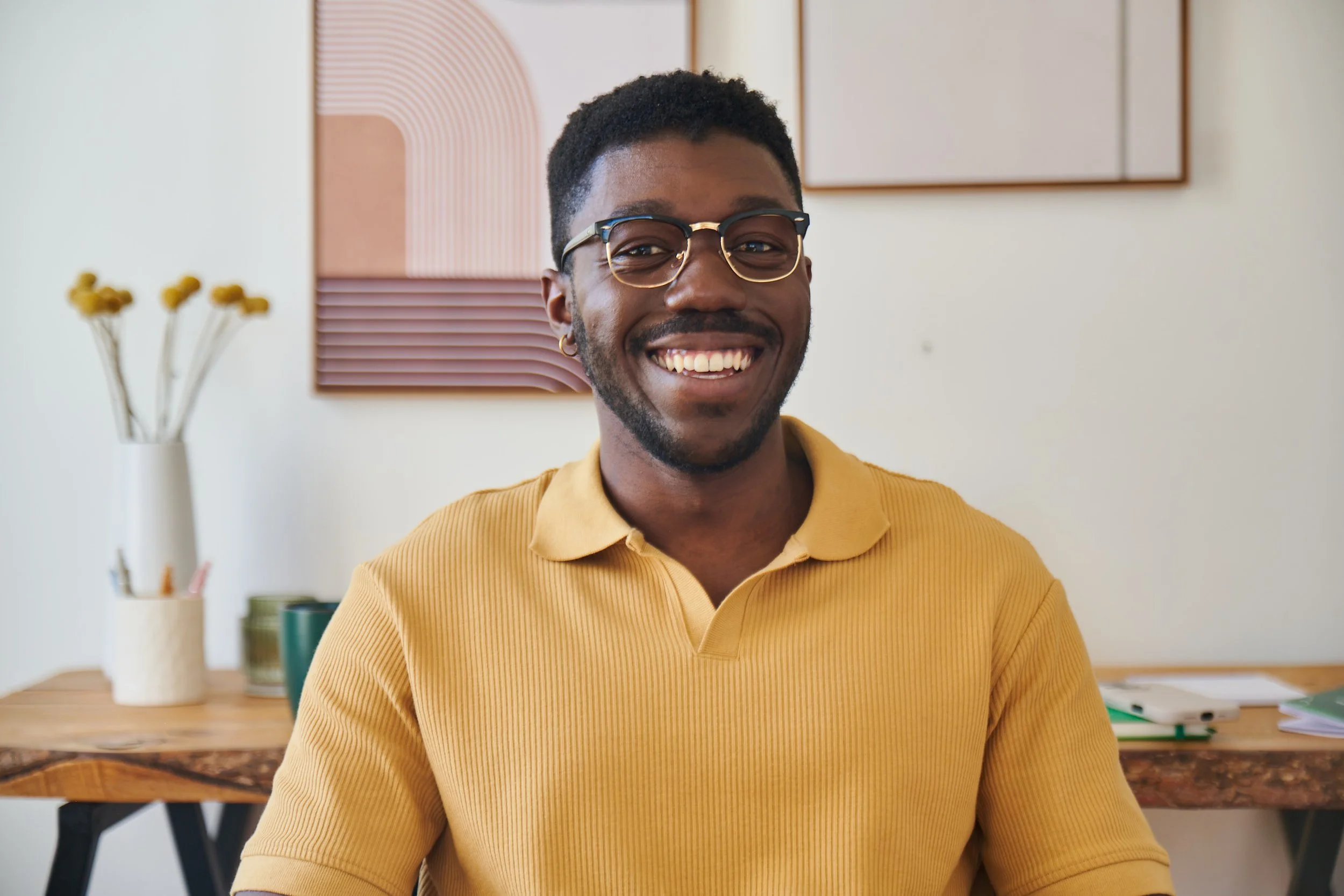
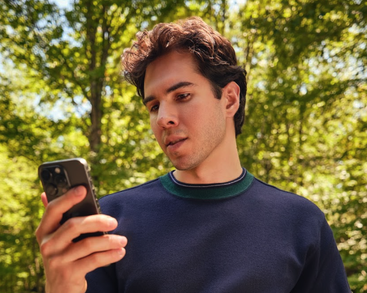
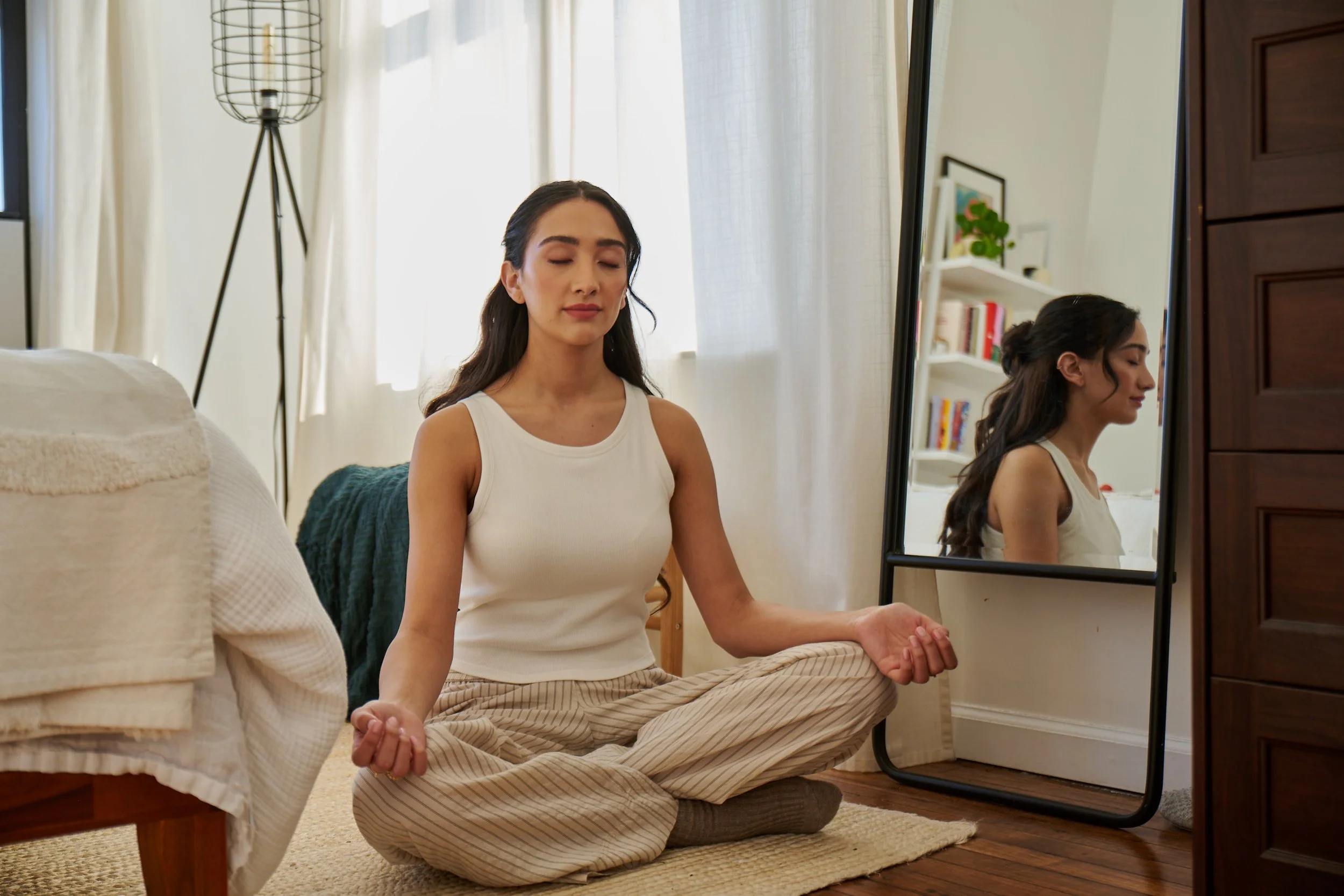
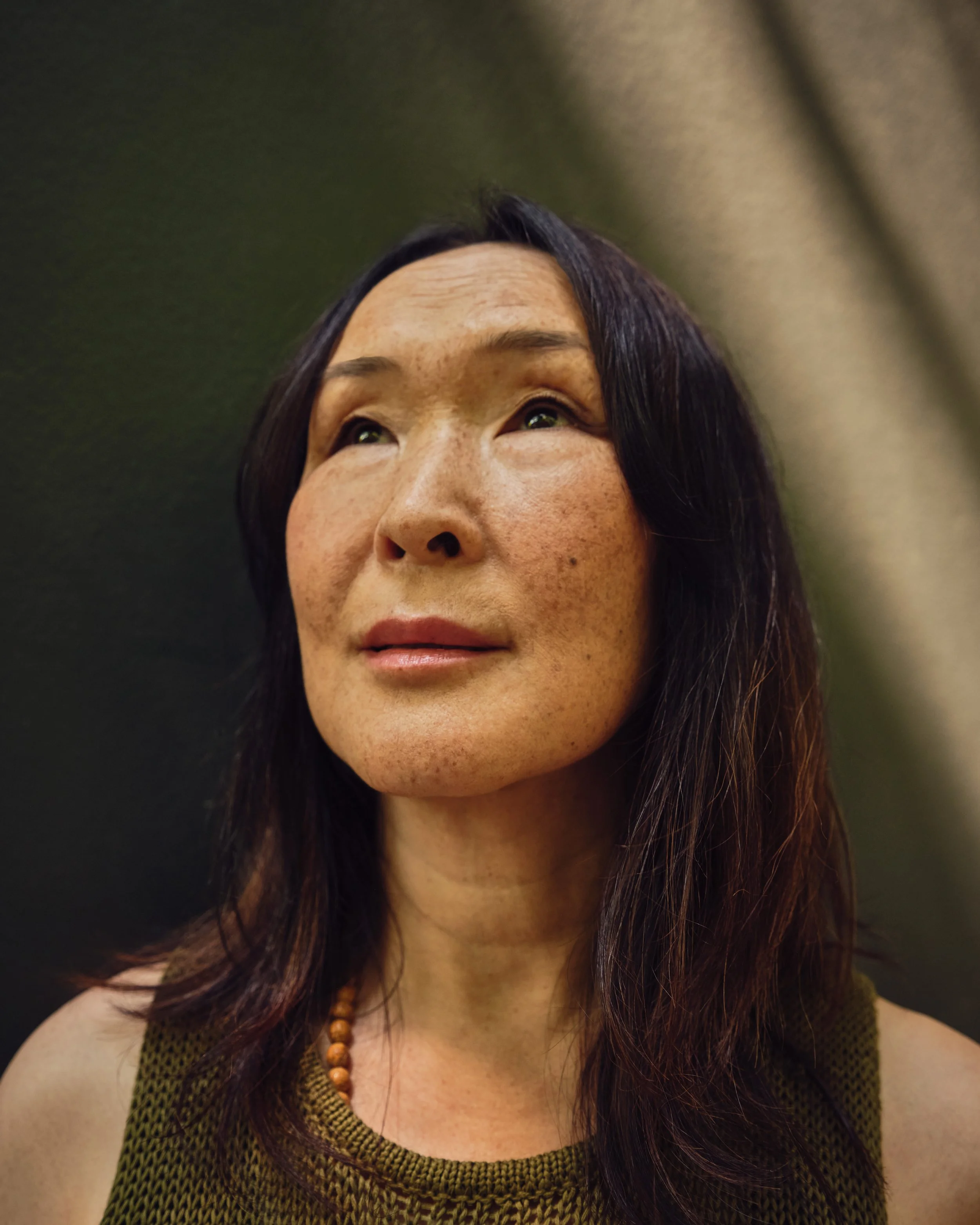
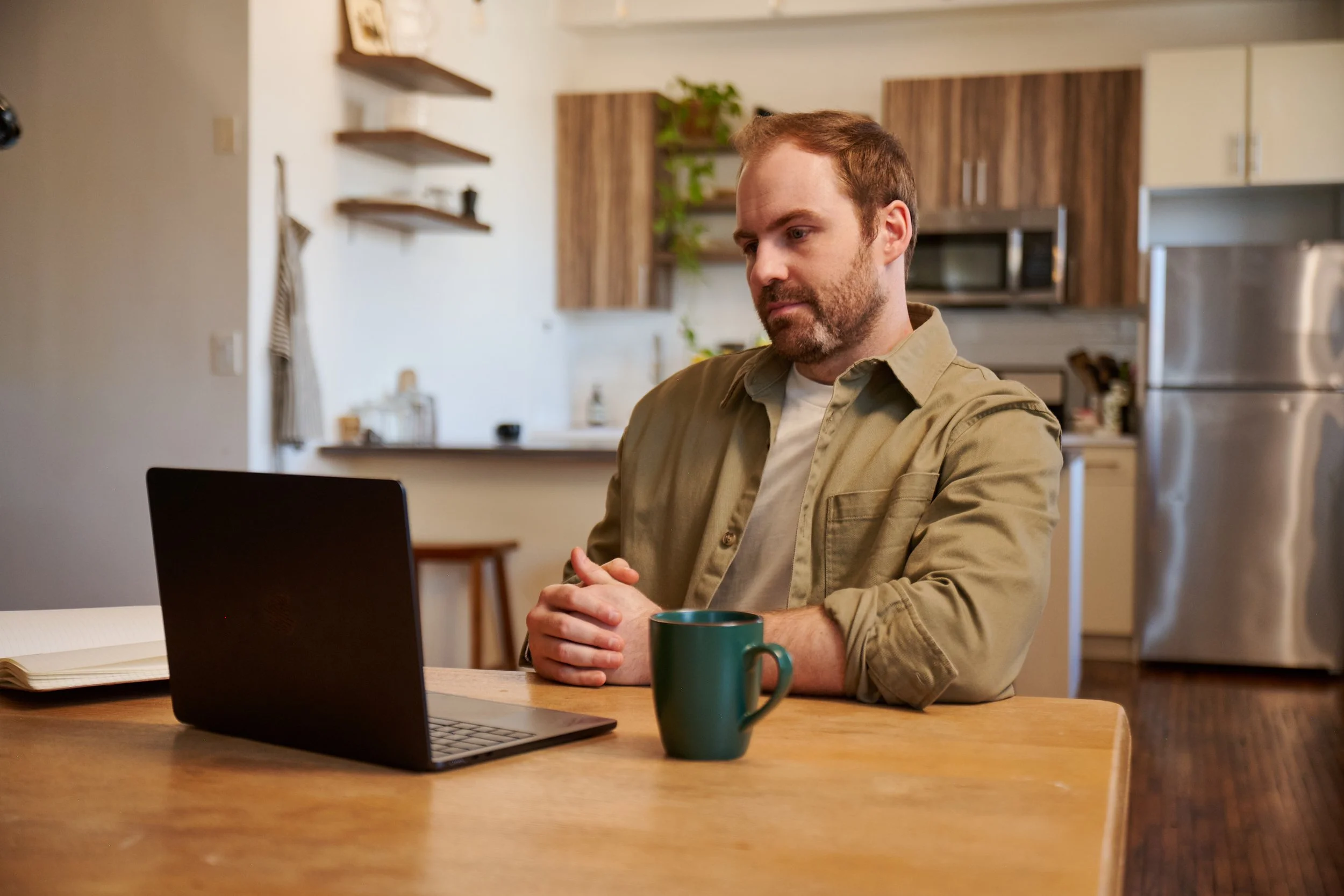
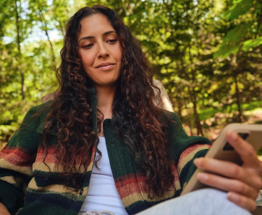
Photography: Elevating the Brand Through Human-Centered Art Direction
As part of the refresh, we significantly elevated our brand presence through a more intentional and strategic approach to photography. We moved away from generic stock and inconsistent imagery by establishing recurring internal photoshoots, allowing us to art direct visuals that fully embodied our new brand direction.
I played an active role in guiding the artistic direction, establishing mood boards, providing post-production editing feedback, and having an on-site presence at the photoshoot to steer direction in real time to ensure imagery felt raw, intimate, and captured real human nuance. This shift made the brand feel more authentic, more emotionally resonant, and more aligned with the lived experience of therapy.
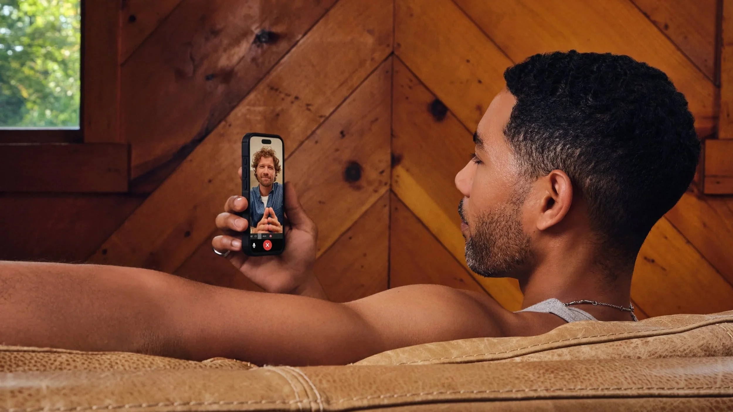
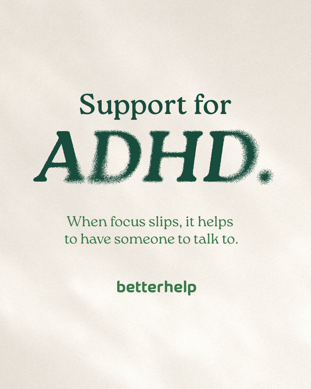
Paid Social Ad Refresh
Our evergreen paid ads no longer reflected our updated brand positioning. I played a lead role in evolving our paid social’s visual presence from bright, illustration-heavy evergreen creatives to lifestyle-forward, clean, conversion-driven assets.
Before

After
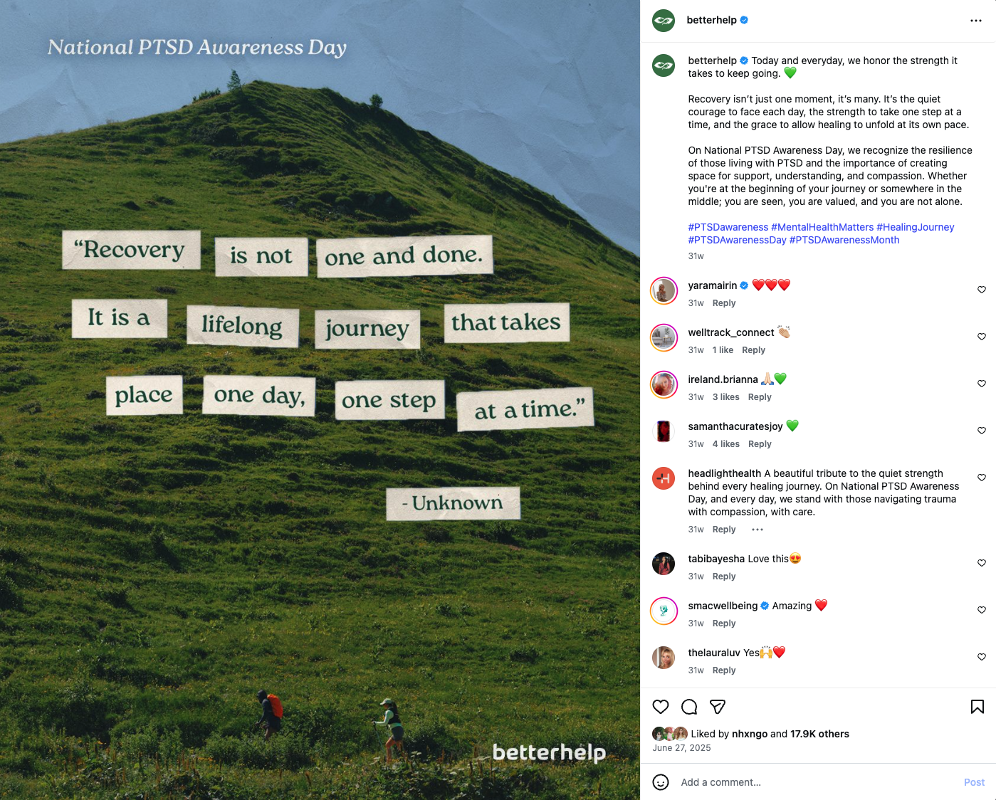
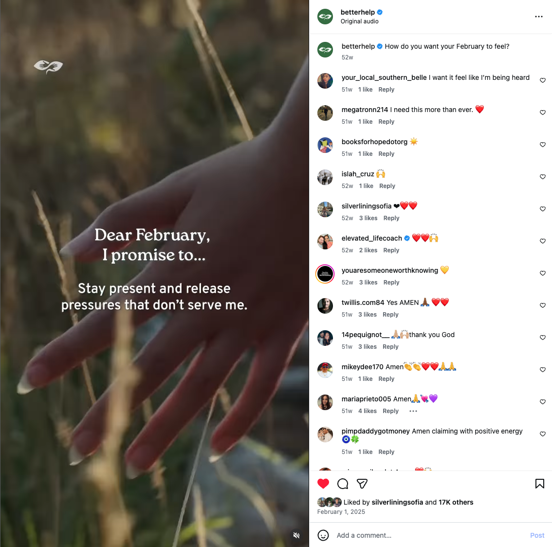
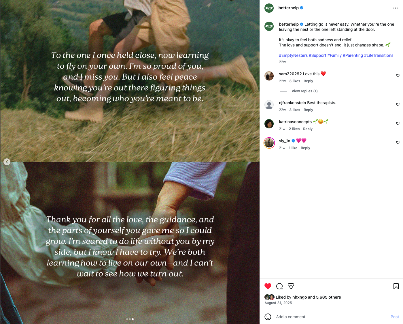
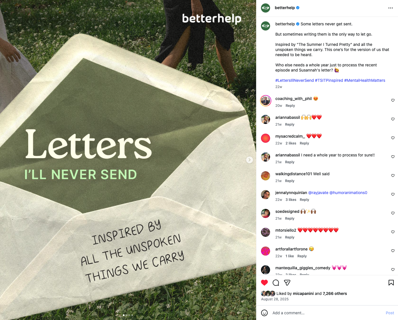
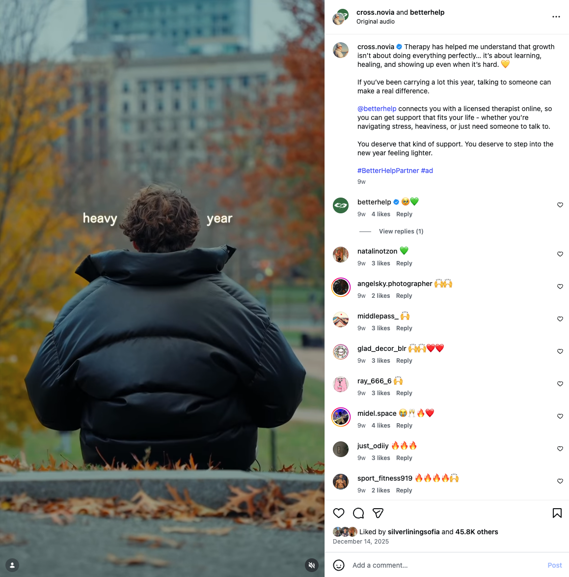
Organic Social Evolution
As the lead designer for organic social, I was instrumental in defining how the refreshed brand would live day-to-day on our organic social platforms. Previously, our social presence was predominantly illustration-based. I evolved the system to incorporate more elevated lifestyle photography, clean layouts, grainy textures and subtle paper-like components to retain warmth and approachability, refined typography and more intentional negative space.
Before
After